Thursday 21 June 2018

EXP 3 WEEK 5 - Final Submission


This is my final submission for Experiment 3. My building bridges Squarehouse and Nida.


I wanted to create circular movement through the walkways.


I incorporated the keywords 'sleek' and 'soaring' in the north facade. I tried to create a building that floats above the campus through glass exterior walls. There is adjustable shading that is one of my moving elements.


In the south facade, there is also adjustable shading that is another moving element.


This is the first floor balcony where you can see the different floors blend into one another.


This is the stairway that connects the floor, I attempted to create a circulation of movement for the students.


I tried to create the idea of suspension through my moving elements and create a lightweight structure that stands out through its shape and form and blend into the environment through the use of materials such as glass.


Lumion and Sketchup Folder: https://drive.google.com/drive/u/0/folders/1H5ASDAEkYy5pv4bYed5LhkbUKIH__Zma

EXP 3 WEEK 5 - Feedback Sheets

EXP 3 WEEK 4 - Brief


The school contains 120 students with 40 students in each year. First and second year mainly work on the ground floor using the lecture and studio spaces, workshop and computer labs. Third years also use the top level space that contains the student research area as their course is predominately research-based. Lecture theatres and studio spaces are combined as there will only be online lectures which are recorded in a lecture recording room. The gallery space is shared with the walkway as student projects will be displayed on the walls and balcony areas.

Lecture Theatre and Studio Spaces 200 sqm (combined due to online lectures)
Lecture Recording Rooms 18 sqm
Workshops 150 sqm
Computer labs 75 sqm
Student Research 180 sqm
Gallery 120 sqm
Academic and Admin Offices 144 sqm
Staff Research 100 sqm
Staff Meeting Rooms 81 sqm
Student Meeting Rooms 81 sqm 
Library 72 sqm

EXP 3 WEEK 4 - 36 Textures


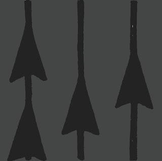
Key words (left to right): expand, arrange, transition, scalar, rotate, linear

Texture 1
This is a 'linear texture' which darkened to use it as a metal material for my railings.


Texture 2
This is a 'linear' texture that I changed to a brown colour to mimic wood panels. I applied this to some flooring in the studio space.


Texture 3
This is a 'rotate' texture which I coloured cream and applied to the restrooms.


EXP 3 WEEK 3 - First and Second Draft

In my first draft, I was inspired by Calatrava's designs and created a shell surrounding my interior walls and floors. However, I did feel like the different shapes weren't connecting and were alienating. I also believe the shell was too big and I did later on reduce its size. In my second draft, I decided to keep the shell as similar to the interior and wanted to make my moving shading a reference to last week's section.


In my second draft, I decided to keep the shell as similar to the interior and wanted to make my moving shading a reference to last week's section.

EXP 3 WEEK 3 - Sections and Architectural Plans

I used the plan of Zaha Hadid's Riverside Museum. I drew my section by using its outline. I developed the shape of my building by using organic, curving lines to give me more variation in experimenting with my section. I was inspired by my theory and attempted to a sleek connection between the different levels of the building.


This is my bubble diagram joining the different spaces in the building.


EXP 3 WEEK 2 - Two Point Perspectives and Moving Elements


My moving elements are my shading which moves according to the angle of the sun. Since there is north-facing glass wall, I decided to use adjustable shading. I'll will also put shading on the south windows.

EXP 3 WEEK 5 - Final Submission

This is my final submission for Experiment 3. My building bridges Squarehouse and Nida. I wanted to create circular movement through th...